Graphic Organisers for Every Subject: A Teacher's Complete Toolkit
Subject-specific graphic organisers for English, Maths, Science, History, and Geography. Dual coding theory foundation with 30+ templates.


Subject-specific graphic organisers for English, Maths, Science, History, and Geography. Dual coding theory foundation with 30+ templates.
A Year 3 maths teacher holds up a chart divided into four quadrants. "We're learning about *part* and *whole*," she explains, drawing a rectangle split in half. "This whole is divided into two parts." She fills one quadrant with circles, the other empty. A learner immediately says, "Oh, so 5 and 3 make 8 because they fit together like that?" The abstract concept of composition suddenly has shape.
Graphic organisers make abstract ideas clear. Paivio (1986) and Mayer (2009) both support the broader principle that words and visuals can work together to aid learning. Mind maps and flowcharts are useful dual coding tools. These diagrams make complex relationships visible for learners: character, cause, process and structure.
Yet most teachers don't use them systematically. They appear sporadically in lessons, often as pre-made handouts rather than thinking tools. This guide organises 30+ graphic organiser templates by subject, shows how to introduce each one, and teaches learners to create their own organisers—a skill that boosts independent learning far more than using your pre-made templates.
Paivio's dual coding theory (1986) argues that humans process information through two channels: verbal (words, sentences) and visual (images, spatial relationships). When you use both channels—say, a word and a picture—you create two memory traces instead of one. Retrieval becomes more likely, and transfer to new situations improves.
Graphic organisers use words and visuals. Flow charts of the water cycle (evaporation, condensation, precipitation) use arrows. Character maps (personality, motivations) use position to show importance. Dual coding aids retention and reasoning (Mayer, 2009).
Diagrams fire up the visual cortex and language centres together, say researchers. This means learners process both shape and meaning (Mayer, 2009). More brain activity creates stronger memories and better learning overall.
Use for: Picture books, short stories, narrative comprehension. Structure: Sequential boxes showing Setting → Characters → Problem → Events → Solution → Ending.
Example: Winnie-the-Pooh (The Hundred Acre Wood / Pooh, Christopher Robin, Piglet / Pooh wants honey / Pooh climbs tree / bees chase him / he hides in mud).
Classroom use: Read a story aloud. After each section (setting, character introduction, conflict, resolution), pause and ask learners to draw or write the key element in the box. This forces attention to story structure.
Character webs help learners understand and compare figures. The centre circle names the character. Radiating circles describe their physical look, personality and motivations. Also include actions, choices, story impact and relationships.
Example: Matilda (Roald Dahl). Central circle "Matilda." Branches: Bookish, intelligent, lonely → Reads constantly, outwits Miss Trunchbull → Gains confidence, makes friend Lavender.
Classroom use: After reading, give each learner one branch to fill in. Discuss how the branches connect. "Matilda's loneliness drives her to books, which makes her intelligent, which lets her outwit Miss Trunchbull." Story causation becomes visible.
Use for: Comparing two characters or two versions of a story. Structure: Two overlapping circles. Left circle: unique traits of Character A. Right circle: unique traits of Character B. Overlap: shared traits.
Comparing Disney's Cinderella and Perrault's Cinderella, some commonalities exist. Both feature kindness and beauty (Disney, Perrault). Stepfamilies oppress them, and both find a love interest with magic (Disney, Perrault). Disney shows glass slippers and a pumpkin carriage. Perrault focuses on virtue and a moral lesson.
Learners compare texts, noticing Disney and Perrault stress different story parts: magic versus morality. This builds critical reading skills, showing stories are interpretations (Zipes, 1988; Tatar, 2003). Teachers can use similar comparison tasks when they want learners to compare viewpoint, values and narrative emphasis.
Use for: Older learners analysing narrative tension; drama and plays. Structure: A mountain shape: Exposition (flat start) → Rising Action (slope up) → Climax (peak) → Falling Action (slope down) → Resolution (flat end).
Example: Romeo and Juliet. Exposition: Two families feud. Rising: Romeo and Juliet meet and fall in love. Climax: Tybalt and Mercutio die. Falling: Friar Lawrence's plan fails. Resolution: Romeo and Juliet die; families reconcile.
Classroom use: Plot diagrams teach learners where tension peaks in stories—useful for writing their own narratives.
Use for: Writing opinion pieces, advertisements, speeches. Structure: Claim (what I think) → Reason 1 (why?) → Evidence (proof) → Reason 2 (why?) → Evidence (proof) → Counterargument (other viewpoint) → Rebuttal (why my idea is stronger) → Conclusion.
Example: "School should start at 9 a.m." Claim: Yes. Reason 1: Adolescents need more sleep. Evidence: Teenage circadian rhythms shift later (biological fact). Reason 2: Later start improves attention. Evidence: Schools with 9 a.m. starts report fewer afternoon behavioural issues. Counterargument: Parents would struggle with childcare. Rebuttal: Benefits to learner wellbeing outweigh logistical challenges.
Classroom use: Scaffold persuasive writing with this organiser. Learners fill it in orally first, then write. It prevents weak arguments and rambling.
Use for: Addition, subtraction, composition, fractions. Structure: Top box (whole) with branches to two boxes below (parts). Or inverse: two parts combine into a whole.
Example: 8 = 5 + 3. Whole (8) branches to Part (5) and Part (3). Learners see that addition is combining parts; subtraction is splitting wholes.
Classroom use: Use this from Reception onwards. It's more powerful than number lines for teaching composition. Once internalised, part-whole thinking transfers to fractions (1/2 + 1/4 = 3/4), algebra (x + y = 10), and problem-solving.
Learners can benefit from bar modelling for problem-solving, especially word problems. These rectangular bars show quantities and support multiplicative reasoning. Empty segments in the bar model represent unknown values (Bruner, 1966).
Example: "Tom has 3 apples. Julia has twice as many as Tom. How many does Julia have?" Bar model: Tom's bar (3 units). Julia's bar (2 × 3 units = 6 units). Visual instantly shows the relationship.
Classroom use: Bar models help learners visualise the *structure* of a problem, not just the calculation. "Do I add, multiply, or divide?" becomes obvious from the diagram.
Use for: Addition, subtraction, sequencing, fractions, place value. Structure: A horizontal line with marked intervals (0, 1, 2, 3… or 0, 0.1, 0.2…). Operations shown as jumps.
Example: 7 + 5. Start at 0, jump 7 units, then jump 5 more units (lands on 12). Learners see that addition is movement, not just a symbol.
Classroom use: Number lines transition learners from concrete (counting on fingers) to abstract (algorithms). Use empty number lines where learners mark their own intervals—more flexible than pre-drawn lines.
Area models support multiplication by making the distributive property visible. Learners can use them to see each partial product before combining the parts. A rectangle divides into sections, and each section represents a multiplication step.
Example: 23 × 15. Draw a rectangle split into four: (20 × 10) = 200, (3 × 10) = 30, (20 × 5) = 100, (3 × 5) = 15. Sum: 345. Learners see that multiplication is *area*, not an abstract procedure.
Classroom use: Area models reveal why the standard algorithm works. Learners aren't just following steps; they understand structure.
Venn diagrams help learners classify shapes and numbers (odd/even, prime/composite). Two overlapping circles represent various properties. Learners place shapes or numbers in the relevant region (Venn, 1880).
Example: Left circle: Has 4 sides. Right circle: All sides equal. Overlap: Squares. Only left: Rectangles. Only right: Rhombuses.
Classroom use: Venn diagrams teach set theory implicitly. Learners develop logical classification skills.
Use for: Plant growth, animal life stages, metamorphosis, ecosystem cycles. Structure: Circular flow: Stage 1 → Stage 2 → Stage 3 → back to Stage 1. Each stage labelled and illustrated.
Research by Hattie (2009) shows feedback significantly improves learner outcomes. Effective feedback, according to Sadler (1989), helps learners bridge the gap between current and desired performance. Shute's (2008) work emphasises feedback should be clear, specific, and timely for maximum impact.
Circular diagrams show cyclical thinking, useful for topics like ecosystems. Learners see that nature has cycles, without fixed beginnings or ends. This helps them grasp complex environmental processes.
Ecosystems show energy flow and predator-prey links. Chains show Sun -> Producer -> Primary Consumer -> Secondary Consumer -> Decomposer. Webs are multiple chains intersecting (Odum, 1971; Lindeman, 1942; Tansley, 1935). Learners benefit from studying both chain and web structures because each representation makes a different relationship visible.
Example: Grassland web. Sun → Grass → Rabbit → Fox. And: Sun → Grass → Locust → Bird → Hawk. Overlap: rabbit and bird compete for grass.
Classroom use: Food webs show interdependence visually. Learners see that removing one species affects multiple others.
Use for: Describing processes (digestion, photosynthesis), understanding cause-effect relationships. Structure: Boxes linked by arrows. First box: cause. Arrow: "leads to." Second box: effect (which becomes the cause of the next effect).
Example: Photosynthesis. Light energy → enters leaf through stomata → absorbed by chlorophyll → glucose formed → plant stores energy.
Classroom use: Cause-and-effect chains prevent vague explanations. Learners must identify *each* step, not just "plants grow when there's light."
Use for: Experiments, fair testing, recording observations. Structure: Columns: Independent Variable (what you change) | Dependent Variable (what you measure) | Control Variables (what stays the same) | Results.
Example: Does soil type affect plant growth? Independent: Type of soil (clay, sand, loam). Dependent: Plant height (cm). Controls: Amount of water, light, temperature, pot size. Results: Growth in each soil type.
They learn to change one thing and see what happens (Klahr et al., 2000). Variable tables help learners think scientifically about fair tests. Learners stop random experiments; they start systematic thinking (Engelmann et al., 2016). Researchers show this benefits understanding (Tschirgi, 1980; Chen & Klahr, 1999).
Use for: Sequencing events, understanding chronology, marking era changes. Structure: Horizontal or vertical line marked with dates. Events plotted at correct positions. Key events illustrated or described.
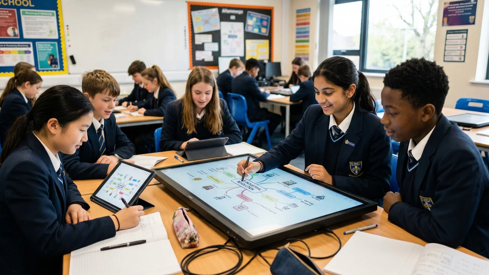
Example: British Industrial Revolution. 1769 (Watt's steam engine) → 1830 (first railways) → 1851 (Great Exhibition) → 1890 (factory boom). Distance between points reflects actual passage of time.
Classroom use: Timelines teach learners that events aren't random; they're ordered. Events close together had quicker causes. Distant events took generations to affect change.
Applications of cause-and-effect understanding help learners interpret events. Structure involves multiple causes leading to a central event. This event, in turn, creates multiple consequences. Teachers can use this organiser to help learners distinguish background conditions, triggers and short- or long-term consequences in history lessons.
Example: French Revolution. Causes: Famine → high bread prices, tax burden on peasants, Enlightenment ideas, weakness of Louis XVI. Central event: Storming of Bastille. Consequences: Abolition of feudalism, Declaration of Rights, terror phase.
Causation diagrams stop learners seeing history as "one cause" (Wineburg, 2001). They reveal that complex events have many reasons. This approach grows advanced historical thought in learners (Perfetti et al., 2013).
Use for: Critically reading primary and secondary sources. Structure: What does it say? (content) | Who made it? (author, bias, purpose) | When/where? (context) | Why does it matter? (historical significance).
Photographs showed workhouses in the 1880s. An unknown photographer, possibly a journalist, took the shot. Children wore uniforms inside a sparse room. Public opinion changed, and photos like this aided reform .
Classroom use: This frame teaches source literacy—learners don't naively accept sources as "truth" but interrogate them as evidence created by humans with purposes.
Use for: Comparing climates, countries, cities, regions. Structure: Two columns or a Venn diagram. Left: Location A. Right: Location B. Rows: Climate, vegetation, human settlement, economy, challenges.
Deserts are hot and dry with little rain (Example). Plants are sparse, and people face water problems. Rainforests are hot and wet with lots of rain. Vegetation is dense, but people face deforestation issues (Example).
Researchers like Hall (2000) showed this improves knowledge retention. Concept mapping, according to Novak (1998), helps learners grasp interconnected ideas. Using comparisons lets learners see how geography affects settlements. Teachers can help learners build a deeper understanding, as demonstrated by Clarke (2005).
Field notebooks help collect outdoor learning data (river studies, surveys, counts). Columns include Location, Observation, Measurement, Sketch, and Interpretation. This structure keeps learner data organised easily.
Example: River study. Location: 50m downstream of bridge. Observation: Brown water, fast flow. Measurement: Width 3m, depth 0.5m, flow speed 0.4 m/s. Sketch: River bed showing pebbles and rocks. Interpretation: Fast flow caused by steep gradient; material worn smooth.
Classroom use: Structured recording during fieldwork prevents aimless wandering and teaches data collection discipline.
Learners compare economic models for Country A and Country B. Use a table to compare primary, secondary, and tertiary industries. This activity helps learners understand trade and industry (Ricardo, 1817; Ohlin, 1933).
Economic activities differ across countries. The UK focuses on finance, retail, and tourism (tertiary sector). Kenya relies more on agriculture, coffee, and tea (primary sector). Secondary industries are growing slowly in Kenya.
These organisers help learners understand economic structures. Geography, history and resources shape nations, both developed and developing. Teachers can use these tools to compare economic systems without reducing complex national contexts to a single factor.
The highest-leverage move is teaching learners to *design* graphic organisers, not just fill in your pre-made templates. When learners choose an organiser type for a problem, they're metacognitive: thinking about how to *represent* thinking.
Week 1–2: You model organiser creation. "We're learning about the water cycle. Which organiser best represents a cycle? A flow chart? A Venn diagram? No—a *circular* diagram, because water cycles back." Make one together. Learners see your reasoning.
Week 3–4: You provide the organiser type; learners fill it in. "For this character, use the Character Analysis Map." Scaffold with sentence starters: "This character is _____, which motivates them to _____."
Week 5–8: Learners choose the organiser with your guidance. "This text compares two ideas. What organiser could show a comparison?" Learners suggest: Venn, two columns, maybe a table. Discuss which *best* represents the comparison.
Week 9+: Learners design their own. "Create an organiser to show how the three main religions share beliefs and differ." Some learners will design three overlapping circles (all Venns aren't 2-circle). Others will use a comparison table. Discuss why each choice makes sense.

Handouts with blank spaces for learners to fill become disconnected from thinking. Instead, create organisers *during* teaching, as thinking tools. Write on them live; add learner ideas in real time.
A Venn diagram is only useful if learners explicitly discuss the overlap. "What's in both circles? How does this shared quality matter?" Without the conversation, the diagram is just a picture.
If every reading task becomes a Character Map, the organiser stops supporting thinking and becomes a procedure. Vary by task: one text needs a Timeline; another needs a Venn; another needs a Cause-Effect chain.
Organisers with 12 boxes and complex instructions overwhelm learners. Start simple: two circles (Venn), three boxes (beginning-middle-end), one central idea with four branches. Complexity grows with practice.
If finished organisers vanish into books, learners don't internalise the structures. Post them on walls. Refer back: "Remember when we used a Part-Whole model for addition? We're using the same thinking for fractions."
Mayer (2009) argues that learners can benefit when words and diagrams are coordinated well. Graphic organisers help by showing abstract links in a spatial way.
Nesbit and Adesope (2006) found that concept and knowledge maps were associated with improved knowledge retention across a range of studies. Effects varied by task, age, subject and comparison condition, so the article should not present one fixed standard-deviation gain as the overall finding.
Transfer improved when learners *created* organisers rather than filled in pre-made ones. Designing an organiser forces learners to identify the *structure* of the content—the skeleton on which facts hang. This structure transfers to new problems.
Using graphic organisers supports learners' thinking. Representing information visually activates dual coding (Paivio, 1971). This reduces cognitive load and makes structures clear for learners (Sweller, 1988; Chandler & Sweller, 1991).
Start by adding one organiser per week to a subject you teach. Choose the organiser type that matches the content (cycles → circular; comparisons → Venn; processes → flowcharts). Use it live, talking through it aloud. Display the finished product. Refer back to it repeatedly.
By term 2, teach learners to choose organisers for themselves. By year's end, they'll design new variations. Graphic organisers shift from your teaching tool to learners' thinking tools—the true mark of pedagogical success.
Free for teachers. The platform builds a classroom-ready lesson plan from your topic in under two minutes.
Dual-coded. Print-ready. Free for teachers.
Open a free account and help organise learners' thinking with evidence-based graphic organisers. Reduce cognitive load and guide schema building dynamically.